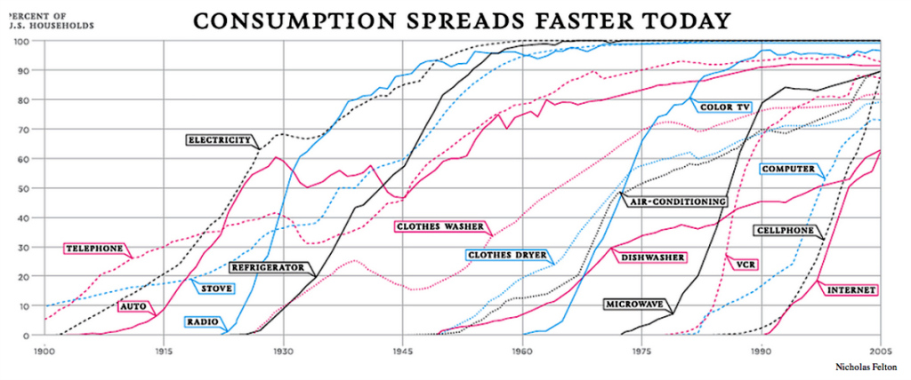
If you’ve ever wondered what an “S-Curve” is in the context of the diffusion of innovations, check out the piece at Quartz on “The Slow Death of the Microwave.” The piece shows what are effectively household adoption rates of various consumer items over the past 100+ years. It is called an “S” curve because the initial roll out tends to be somewhat prolonged (the bottom _ of the S) followed by a rather steep increase as the item catches on (the / part), and finally a leveling off when most of the population has adopted it. The curves themselves contrast both rates of diffusion and total penetration rates. The microwave, for example, went from 10 to 80% of households in a ten-year period. Compare that with stoves, washers, dryers, and even telephones, which took their sweet time becoming the proverbial “household” items.
The figure* actually says a lot about the characteristics of American households. At the onset of World War II, for instance, the majority of households did not have refrigerators, clothes washers, telephones, or color televisions. The curves also show the dramatic impact of the Great Depression on the diffusion of telephones, electricity (both stunting then accelerating diffusion), and automobiles.
As for the article, it’s a fascinating look at the microwave, though it seems a bit premature to be calling its “death,” given that the vast majority of households can still pop corn and defrost meat in short order. Bloomberg seems to agree with me on this point.
But when you read a little deeper, it turns out that people aren’t actually abandoning microwaves; they’re just not replacing them as frequently.
Yep. Still some cool graphics, though.
