Data Presentation

Tag: Data Presentation

World Cup Infographic

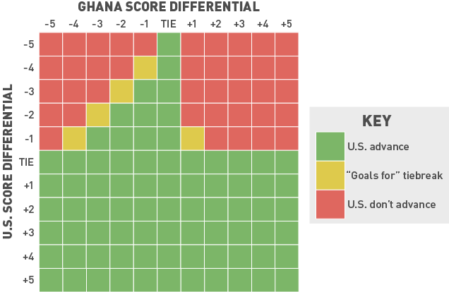
From the always helpful folks at Deadspin, I give you an infographic with the rundown of the US prospects to advance to the Round of 16.  Note that the “Ghana Score Differential” on the top axis is for the Ghana-Portugal game.  The first tiebreaker is goal differential, which is what this graphic breaks down.  The second tiebreaker is total goals scored over three games (the gold boxes).

Here are the take-home points:

  • The US are in with a win or a tie.
  • The US are in with a Ghana-Portugal tie.
  • Absent that, US fans should probably root for a low-scoring Ghana-Portugal contest, with Portugal as the rooting interest.


Deadspin

Goodness, A Fit!

Tyler Vigen has opened up the world of spurious correlations like no other with his aptly titled website, Spurious Correlation.  Whether it’s the remarkably tight relationship between US spending on science, space and technology with suicides by hanging, strangulation and suffocation or a more loosely related relationship between Stanley Cup goals and Suicide by Pesticide (I made that one up myself!), Vigen is Johnny-on-the-Spot with fitting data for no greater purpose than amusement.

goals-scored-by-winning-team-in-stanley-cup-finals_suicides-by-pesticidesVia Kottke, of course.

Income Deciles Through the Years

Jordan Weissmann at The Atlantic points us to a noteworthy breakdown of income changes through the years.


The Rich Get Poorer, The Poor Get Poorer


This tells a pretty interesting story. Coming out of World War II, the gains in the bottom decile are pretty solid up until the 1970s, when they seem to stagnate along with all other income groups.  It isn’t until the  1980s and 1990s that the top income bracket really takes off.

There are, of course, dozens of caveats with data like these.  But those aside, data guru Andrew Gelman simply doesn’t like this plot, so he takes some pains to make this clearer.  Here’s Gelman’s discussion, and below you can see roughly the same data in a more conventional time series format.


As Gelman correctly points out, his full series tells a different story. In particular, the sharp income decrease of the last decade occurred principally since 2007.  Yikes.

Gelman is great with data.  If you are interested in empirical social sciences, I recommend you check him out at The Monkey Cage or at his blog, or one of his many excellent books.