In Case You Were Wondering

Category: In Case You Were Wondering

Into the darkness they go, the wise and the lovely

Those of you who are acquainted with my writing on this blog probably know that (a) I study mortality risks, and (b) I sometimes comment on how these risks change when the clocks spring forward and fall backward.   This fall is no exception, as I have a piece in the venerable Costco Connectionmaking the case that maybe keeping Daylight Saving Time as is wouldn’t be the worst thing to happen to the world.  (I could have made the case the other way, as the policy decision here is very unclear, which tends to favor the status quo).

As per usual, the the remarkable Gaisma.com site shows us what’s at stake here in Appleton.  The break in the series starting in month 11 is upon us:

The Appleton Day

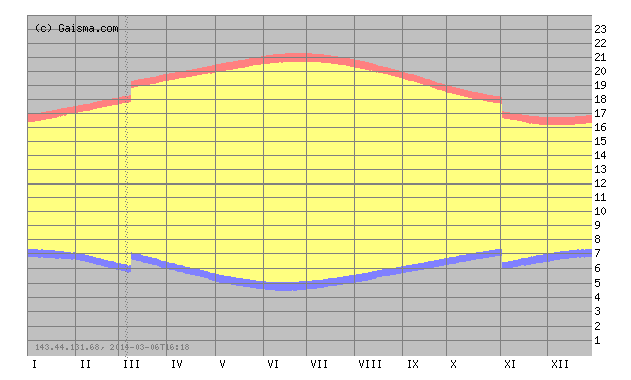
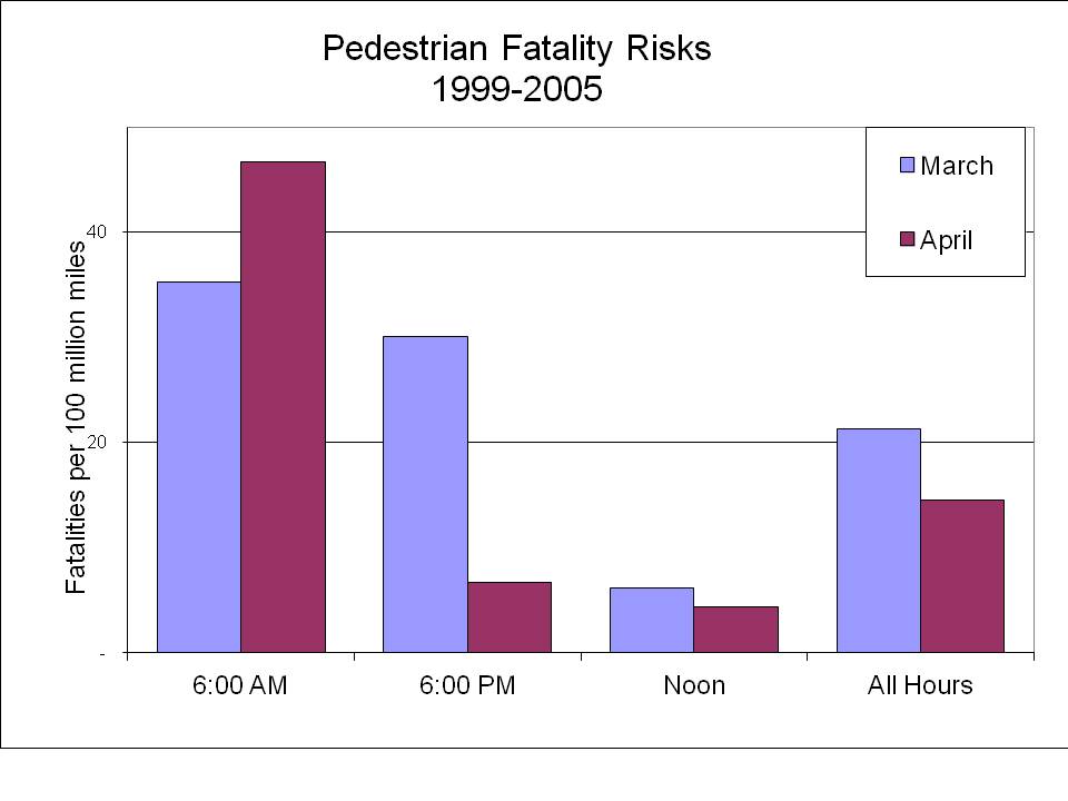
What does this mean for you?  Well, starting Sunday it is going to be dark at 5 p.m.  meaning that you are far more likely to get hit by a car at 5 p.m. next week than you are this week.   When I say “far more likely,” our estimate is that the risk is about three times as high!

Of course, you are also far less likely to get hit at 6 a.m. in the extremely unlikely event that you are out 6 a.m.  But, notice, but January 1 the sun won’t rise until after 7 a.m., and if DST was permanent, that would be 8 a.m.   Sunlight is the ultimate scarce resource.

Here is our previous coverage.

* The picture in the Costco piece is of me enjoying some daylight at Wrigley Field. Should Daylight Saving Time be eliminated? Of course not! More daylight means more daytime ball games.

Infrastructure Spending Is Not The Holy Grail

Politicians of all stripes (including Clinton, Sanders and Trump) seem to believe that more Federal spending on infrastructure is essential to increasing economic growth and creating attractive employment opportunities. In a recent lengthy article in City Journal, economist Edward Glaeser begs to differ. Glaeser, author of The Triumph of The City, recognizes that much of our infrastructure needs attention due to deferred maintenance, but that Federal money devoted to large scale infrastructure projects tends to be both inefficient and inequitable. Below are a summary of a few of his observations. I encourage you to read the entire article.

1. Many projects serve very few people; some have been described as “bridges to nowhere.”
2. Funding tends to follow political influence rather than economic need.
3. Most projects do not come close to passing any type of benefit-cost test.
4. Although projects in the late 1800s and the first half of the 20th century did lead to both increased productivity and employment, later 20th century projects and 21st century projects tend to generate neither increased productivity nor employment opportunities, especially for areas with high unemployment rates.
5. Consistent with point 2, many projects involve subsidies from poorer to richer parts of the country.
6. Both efficiency and equity would be improved if infrastructure projects, especially those related to transportation, were funded locally by users.

The New Economics of Religion

That’s the title of a June 2016 Journal of Economic Literature piece, available at a website near you.   Typically, this wouldn’t warrant a response from the Lawrence Economics Blog, but typically you don’t see accolades like this directed towards one of our own:

One of the classic papers written on the economics of religion, Azzi and Ehrenberg (1975), summarized the literature on what the empirical correlates of religiosity had discovered about the United States until then.

Wow, classic papers!  If you see Professor Azzi, be sure to ask him about the genesis of that paper.

  • Sriya Iyer. 2016. “The New Economics of Religion.” Journal of Economic Literature, 54(2): 395-441.
  • Corry Azzi and Ronald Ehrenberg. 1975. “Household Allocation of Time and Church Attendance.” Journal of Political Economy 83 (1): 27–56.

Springing Forward

It is that time of year where the days get longer, aided by a single leap and bound.  This Saturday into Sunday, much of the US will push its clocks forward by one hour.  Despite the “Daylight Savings” moniker, there is no actual daylight saved — it just shifts an hour from the morning to the evening.   The consequences of this likely will affect whether some people live through the rest of March or not, as I pointed out in the New York Times Room for Debate section a few years ago.  My contribution has to do with the changes in pedestrian fatality risks and total fatalities associated with the time change.  I also wrote a more general piece for the Appleton Post-Crescent.  Below is my semi-annual rehash of a previous post…

So, what does a time change look like?  Glad you asked:  The figure from the sunshine authority, Gaisma.com, shows daylight patterns for our own Appleton, Wisconsin.  Each day starts with midnight at the bottom and goes to the top, and the months go left to right.  The blue line is the dawn and the red the dusk.

The Appleton Day
Appleton Time

The switch to DST in March and the switch back to standard time in November are clear — they are the discontinuities (the “breaks”) in the sunrise and sunset curves.  Because we “spring ahead” one hour, the sunrise time on Sunday morning will be one hour later than it was on Saturday.  An early morning walk that was in that daylight on Saturday will be in the dark on Sunday.  To have a sunrise at the same time as Saturday’s, we will have to wait until early April.  The opposite happens in the evening.  Sunset will be one hour later starting on Sunday.  There will be less light in the morning, but more light in the evening.

Light and visibility are extremely important determinants of traffic safety, particularly for pedestrians.  Paul Fischbeck and I looked at data from 1999-2005 on fatalities and travel patterns, and determined that the morning risk increases about 30% per mile walked, while the afternoon risk falls close to 80%.

The figure below shows pedestrian fatality risks from 1999-2005.  The blue and maroon bars show fatality risks per 100 million miles walked in March and April, respectively.  Note that for the 6 a.m. time slot the risks increase about 30%, whereas for the 6 p.m. time slot the risks take a sharp nosedive.  At midday the risks stay right about the same (we found no statistically significant difference in risks for that time period).  Overall, total pedestrian fatalities decrease in the Spring both because risks fall more in the evening than they rise in the morning, and there are many more people out later in the day.

Ped Spring

These data are rather crude in the presentation, as they do not focus specifically on the days leading up to and immediately following the time shifts, which is how researchers typically isolate the effects of the time change.

Here are some references for those interested:

S A Ferguson, D F Preusser, A K Lund, P L Zador, and R G Ulmer “Daylight saving time and motor vehicle crashes: the reduction in pedestrian and vehicle occupant fatalities,” American Journal of Public Health 1995 85:1, 92-95

J M Sullivan and M J Flannagan, “The role of ambient light level in fatal crashes: inferences from daylight saving time transitions,” Accident Analysis & Prevention, 2002 34:4, 487-498

D Coate and S Markowitz, “The effects of daylight and daylight saving time on US pedestrian fatalities and motor vehicle occupant fatalities,” Accident Analysis & Prevention, 2004, 36: 3 351-357

Economics is What Economists Do

The post title is, of course, from the late, great Jacob Viner, who tells us that it isn’t totally easy to characterize exactly what it is that we economists do.  The alive, possibly great Daniel Hamermesh from the University of Texas has been making some headway on cataloging exactly what that is.  And, increasingly, it appears that the top journals are featuring more empirical work and less theory.

Justin Fox at Bloomberg tells us all about it.*

Or just look at the picture:

Is this part of the big data revolution we’ve been hearing so much about?

Potentially more interesting is that experimental makes up almost 10% of the total.


* Actually, Hamermesh published the paper several years ago, but I guess the news cycle is slow getting around to reading the Journal of Economic Literature.

American Household Income Has Been Stagnant Since the 1970s or Has It?

As you might guess, it all depends upon what one chooses to observe.  A new article by Robert Shapiro pulls the pieces apart to show that median household income has not moved much since the 1970s; however, it varies greatly by age group and presidential regime.

http://www.brookings.edu/~/media/Blogs/FixGov/2015/03/shapiro_figure1.png?la=en

For example, 25 – 29 year olds in 1975, 1982, 1991, and 2001 all saw their household incomes rise for at least one decade after those designated dates.  Furthermore, the 1980s and 1990s saw relatively continuous median household income growth for those aged 25-29 at the beginning of each decade with incomes falling since the early 2000s.  Even those 25-29 saw their incomes rise post 2001.

“Shapiro concludes that ‘our current problems with incomes are neither a long-term feature of the U.S. economy nor merely an after-effect of the 2008-2009 financial upheaval.’ Nor are they driven by ‘economic impediments based on gender, race and ethnicity, or even education.’ He identifies two structural causes; globalization and information technologies. But he also asks us to think about what Reagan and Clinton did that the two presidents of the 21st century did not do. ‘The Clinton and Reagan fiscal approaches supported stronger rates of business investment than seen under Bush-2 or Obama. In addition, their support for aggregate demand included public investments to modernize infrastructure, broaden access to education and support basic research and development.’ ”

When pundits discuss the economy in general and “middle class economics” in particular, they should bear the above evidence in mind. As is typically the case, averages hide more than they reveal.

Be Like Mike?

Michael Greenstone, that is.

One of our esteemed alums forwarded me the link to the eponymous “Which famous economist are you most similar to?” website, and yours truly — though I probably shouldn’t be telling you this — has landed atop Professor Greenstone, the University of Chicago energy economist and President Obama’s former Chief Economist for the Council of Economic Advisers.

The data are procured from the University of Chicago’s periodic IGM Economic Experts Panel, and the matching is done via a principal component model (which, I suppose is ironic, because the principal-component model isn’t really part of our standard toolkit).  That bit of hilarity aside, here is what it looks like:

LikeMike

Daron Acemoglu

Though I landed near Professor Greenstone, I, pictured here as a red dot, was actually matched with Daron Acemoglu.  Unfortunately, I couldn’t think of a good post title playing on the word “Daron”.     Perhaps I should have been a little bit more….  adventurous?

World Cup Infographic

From the always helpful folks at Deadspin, I give you an infographic with the rundown of the US prospects to advance to the Round of 16.  Note that the “Ghana Score Differential” on the top axis is for the Ghana-Portugal game.  The first tiebreaker is goal differential, which is what this graphic breaks down.  The second tiebreaker is total goals scored over three games (the gold boxes).

Here are the take-home points:

  • The US are in with a win or a tie.
  • The US are in with a Ghana-Portugal tie.
  • Absent that, US fans should probably root for a low-scoring Ghana-Portugal contest, with Portugal as the rooting interest.


Deadspin

World Cup Predictions

analyst

Once again the World Cup is upon us, and once again my friends and colleagues are pumping me for information about who I’m picking. Well,like American coach Jurgen Klinsmann, I am not picking the Americans.   

Who then?  

Well, I suppose you could do worse than ask a bunch of economists:

Brazil will beat Germany to win soccer’s World Cup and also will score the most goals, according to a survey of economists across 52 countries.

The tournament’s host nation eclipsed Germany and Argentina as the top choice among 171 economists from 139 companies in a Bloomberg News poll published today. The Latin American country is also tipped to find the net the most times, topping Argentina and Spain.

Projections of a sixth World Cup victory for Brazil mesh with bookmaker odds and forecasts based on economic models created by Goldman Sachs Group Inc., UniCredit SpA and Danske Bank A/S. Paddy Power Plc and Ladbrokes Plc both rank Brazil as favorite, at odds of 3/1….

How this survey is newsworthy is an interesting question, I suppose.    As I type this, Brazil is down 1-0 to Croatia in the opening match.

Goodness, A Fit!

Tyler Vigen has opened up the world of spurious correlations like no other with his aptly titled website, Spurious Correlation.  Whether it’s the remarkably tight relationship between US spending on science, space and technology with suicides by hanging, strangulation and suffocation or a more loosely related relationship between Stanley Cup goals and Suicide by Pesticide (I made that one up myself!), Vigen is Johnny-on-the-Spot with fitting data for no greater purpose than amusement.

goals-scored-by-winning-team-in-stanley-cup-finals_suicides-by-pesticidesVia Kottke, of course.

Life is Priceless: Only if You are an Incurrable Romantic

In this New York Times blog posting, Uwe Reinhardt, one of the most eloquent economists I have ever heard speak, tweaks Congress for its ignorance of the notion of opportunity cost and for a lack of understanding of the fundamental principles of policy making.  Furthermore, he provides a link to a marvelous discussion between Milton Friedman and a University of Chicago student that took place as part of the Free to Choose series in the 1970s.

Truth And Consequences 512

How Sensitive Are You?

The Washington Post gives us a fascinating glimpse into the choice of the economics major (is there anything about economics that’s not fascinating?).

Executive Summary:  Women are more grade sensitive than men.

econ dropoff gradiant by men v women

The data are from an “anonymous research institution” and the relationship of interest is the choice of the economics major based on the grade in the introductory economics class.  For students getting As, for example, about 40% of males and between 40 and 45% of females go on to major in economics.  For males, that’s pretty much true whatever grade they get, but females appear to be far more responsive to lower grades.  The starkest comparison is for the A and the B+ students.  Approximately 40% of male students who get an A or B+ become majors, whereas for females there appears to be about a 30% dropoff in the probability of becoming a major as the grade goes from an A to a B+.  The interpretation is that women are more grade sensitive than men, and as a result move on to a different discipline, where presumably their grades are likely to be higher.

Here’s Harvard’s Claudia Goldin:

“Maybe women just don’t want to get things wrong,” Goldin hypothesized. “They don’t want to walk around being a B-minus student in something. They want to find something they can be an A student in. They want something where the professor will pat them on the back and say ‘You’re doing so well!’ ”

“Guys,” she added, “don’t seem to give two damns.”

I wonder what percentage of men and women go into an economics class with the idea that they are going to major in the subject?  One possibility is that more men plan to go into economics, and are less discouraged by a “low” grade. Notice that overall, between 30 and 40% of men who take that class wind up as majors.  We also know that men account for just over 70% of majors.  So if we assume an equal split of men and women in going into an intro class of 100 people at the school where the data were collected, we might expect 17.5 men and 7.5 women to wind up as majors. 

Incidentally, I looked at the past several years of data and 35% of our graduating seniors have been women, which is a solid 20% higher than the national average of 29%.

102 Days and the LU Curling Club

Curling
Click for a bigger Spiel

This past week President Burstein hosted a pizza gathering in anticipation of the annual 102-Day Senior Party.  As the name indicates, the party marks only 102 days until Commencement for our out-going Seniors, assuming their Senior Experience papers get whipped into shape.

Though I was not able to attend (invitation lost, perhaps?), I see that the President’s gathering included some charter members of the Lawrence Curling Club, of which I am the faculty sponsor.  Pictured is the president with some of our young curlers, who are no doubt explaining that “take out” is not pizza related, nor does “hog line” have to do with diners queuing for sausage pizza.

More Light?!?

I am one of the contributors to the New York Times Room for Debate section today on Daylight Saving Time.  My contribution has to do with the changes in pedestrian fatality risks and total fatalities associated with the time change. (UPDATE:  There is also a piece up in the Sunday Appleton Post-Crescent).

So, what does a time change look like?  Glad you asked:  The figure from the sunshine authority, Gaisma.com, shows daylight patterns for our own Appleton, Wisconsin.  Each day starts with midnight at the bottom and goes to the top, and the months go left to right.  The blue line is the dawn and the red the dusk.

The Appleton Day
Appleton Time

The switch to DST in March and the switch back to standard time in November are clear — they are the discontinuities (the “breaks”) in the sunrise and sunset curves.  Because we “spring ahead” one hour, the sunrise time on Sunday morning will be one hour later than it was on Saturday.  An early morning walk that was in that daylight on Saturday will be in the dark on Sunday.  To have a sunrise at the same time as Saturday’s, we will have to wait until early April.  The opposite happens in the evening.  Sunset will be one hour later starting on Sunday.  There will be less light in the morning, but more light in the evening.

Light and visibility are extremely important determinants of traffic safety, particularly for pedestrians.  Paul Fischbeck and I looked at data from 1999-2005 on fatalities and travel patterns, and determined that the morning risk increases about 30% per mile walked, while the afternoon risk falls close to 80%.

The figure below shows pedestrian fatality risks from 1999-2005.  The blue and maroon bars show fatality risks per 100 million miles walked in March and April, respectively.  Note that for the 6 a.m. time slot the risks increase about 30%, whereas for the 6 p.m. time slot the risks take a sharp nosedive.  At midday the risks stay right about the same (we found no statistically significant difference in risks for that time period).  Overall, total pedestrian fatalities decrease in the Spring both because risks fall more in the evening than they rise in the morning, and there are many more people out later in the day.

Ped Spring

These data are rather crude in the presentation, as they do not focus specifically on the days leading up to and immediately following the time shifts, which is how researchers typically isolate the effects of the time change.

Here are some references for those interested:

S A Ferguson, D F Preusser, A K Lund, P L Zador, and R G Ulmer “Daylight saving time and motor vehicle crashes: the reduction in pedestrian and vehicle occupant fatalities,” American Journal of Public Health 1995 85:1, 92-95

J M Sullivan and M J Flannagan, “The role of ambient light level in fatal crashes: inferences from daylight saving time transitions,” Accident Analysis & Prevention, 2002 34:4, 487-498

D Coate and S Markowitz, “The effects of daylight and daylight saving time on US pedestrian fatalities and motor vehicle occupant fatalities,” Accident Analysis & Prevention, 2004, 36: 3 351-357


Calculating a GPA

Have you ever wondered how to calculate your grade point average?  If so, boy have you come to the right blog post.

Here’s what you need to do:  Take your Grade in a given course and assign it the number of Points for that grade (e.g., an A is 4 points, A- 3.75 points, B+ 3.25 points, etc).*

Once you’ve taken care of that, multiply the number of Points by the number of Earned Units for that course.  So, for example, if you earn an A in a six-unit course, your total quantity of points (Qty Points) would be 4 points for an A times 6 Earned Units = 24.  

Now you can add up your total Qty Points and divide by GPA Units and, wah lah, you have your Grade Point Average. 

As example, you take four courses in your first term, get a B in Freshman Studies, a B+ in Geology, and an S in Economics because you S/Ued the course, an a B in a one-unit piano performance course.  Your grade point average would only include courses with grades and would be calculated thusly:

(3 points x 6 units + 3.25 points x 6 units + 3 points x 1 unit) / 13 units = 3.12

 And if you’d like an Excel spreadsheet that does it for you, here it is (email Professor Galambos with comments or questions about the spreadsheet).

* A full list of Grade Points can be found here


Last Minute Shopping Guide

Assuming you shop, that is.  Why would you shop when you know that cash transfers are always preferred?

Or are they?

Yes, it’s time once again for me to re-post a post that I worked on pretty hard once upon a time, but now just mail it in.

And away we go:

Score
Thank you Professor Waldfogel!

It’s that time of year where we bid you Happy Holidays from the Economics profession.

Up first, we have a truly heroic figure, Joel Waldfogel, author of Scroogeonomics.*  I don’t know your preferences as well as you do, so whatever I give you is probably sub-optimal, unless you tell me exactly what you want.  And even then, wouldn’t you rather just have the cash anyway?  For those of you who are intermediate micro students, you know that the kids (a.k.a., utility-maximizing agents) always prefer cash over any in-kind equivalent.

Kudos to Professor Waldfogel for willing to be “that guy.”

2013 Update: The median leading economist probably doesn’t believe this.

Anyway, speaking of Scrooge, was he really such a bad guy?  Not so, says Steven Landsburg. Let’s give it up for our annual Scrooge endorsement from this classic Slate piece:

In this whole world, there is nobody more generous than the miser–the man who could deplete the world’s resources but chooses not to. The only difference between miserliness and philanthropy is that the philanthropist serves a favored few while the miser spreads his largess far and wide.

If you build a house and refuse to buy a house, the rest of the world is one house richer. If you earn a dollar and refuse to spend a dollar, the rest of the world is one dollar richer–because you produced a dollar’s worth of goods and didn’t consume them.

Ah, I just feel all warm and fuzzy inside.

Moving on to The Atlantic, where we have “The Behavioral Economist’s Guide to Buying Presents.” Now this is some truly indispensable advice.  Like Waldfogel above, the money point is to just give money. But, for the true romantics who feel compelled to give a gift, the behavioralists recommend this:

Buying for a guy? Get him a gadget. Buying for a girl? Get her something expensive and useless.

The gadget I get.**  The expensive and useless? That’s from Geoffrey Miller’s, The Mating Mind.  Here’s a brief explanation of courtship:

The wastefulness of courtship is what makes it romantic. The wasteful dancing, the wasteful gift-giving, the wasteful conversation, the wasteful laughter, the wasteful foreplay, the wasteful adventures.  From the viewpoint of “survival of the fittest” the waste looks mad and pointless and maladaptive… However, from the viewpoint of fitness indicator theory, this waste is the most efficient and reliable way to discover someone’s fitness. Where you see conspicuous waste in nature, sexual choice has often been at work.

This presents something of a conundrum because “expensive and useless” seems to be at odds with Waldfogel’s hyper-utilitarian cold, hard cash suggestion.

So if you want to hedge your bets, give her Euro!***

* The book is a follow up to the classic, “The Deadweight Loss of Christmas.”  Clearly, the book title Scroogonomics can be chalked up to the value-added of the publishing house.

**Conceptually, that is. I generally get ties and socks.

***Okay, that joke was funny back when I wrote it and the Euro was doomed.