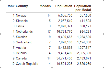
Posts Tagged ‘Back of the envelope’

That’s Why We Have the Q Requirement

Friday, May 10th, 2013

The New York Times reports on a fascinating new exercise regimen: The Scientific 7-Minute Workout.

How can you get all that done in just seven minutes?  Well, first, the routine consists of twelve intense 30-second exercises (12 exercises x 30 seconds/exercise = six minutes).  Then we have to add a 10-second rest period between each exercise (11 rest periods x 10 seconds / period = 1 minute, 50 seconds).

Let’s see, so the 7-minute workout consists of six minutes of exercise and 1:50 worth of breaks…  Don’t mess with science, I guess. 

Modelo Justice

Wednesday, February 6th, 2013

Blocked!

Amidst the hoopla of the triumphant release of Budweiser Black Crown, the King of Beers learned that its $20.1 billion offer to purchase Grupo Modelo — maker of Corona, that beer people put lemons in — had been given the kibosh by the good folks at the Department of Justice.

One of the key DoJ players in the blockages is our own LU alum William Baer, who had this to say:    

This is the sort of product that matters to consumers. If you have a very slight price increase that happens because of this deal, it could mean that consumers will pay billions of dollars more.

Now, reaching for the back of my envelope, the average American guzzles down about 30 gallons of beer per year, about a half gallon per week.  Now, if the price per gallon goes up $0.10, that would entail about $3 per person per year times 300 million people, or about a billion dollars (assuming the demand for beer is pretty inelastic, of course).

On the down side of all this consumer largess, young folks will probably be saddled with more STDs!

Thanks you to the formerly bearded “Mr. T” for the tip.  Those of you in the 400 class should take a look.  Very interesting stuff.

People, It is a Commodities Boom

Friday, September 21st, 2012

If you didn’t know already, the U.S. and many other parts of the world are amidst an epic energy boom that has sent natural gas prices tumbling.  One back-of-the envelope calculation suggests that consumers have benefited to the tune of more than $100 billion (that’s a lot); another suggests it’s more like $300 billion annually (that’s even more).

So, with that in mind, which group of graduates on average do you think earned a higher starting salary last year — those from Harvard University or those from the South Dakota School of Mines & Technology?

Answer here, if you haven’t already guessed.

Plenty more at the Mark Perry’s blog.

Well, Just Wait Until the Winter Games

Wednesday, August 15th, 2012

We’re #8!

Some of you are aware that the summer Olympics have been taking place over the past few weeks, with athletes all around the world convening in London to kick each other, swim and dive in perfect synchronicity, throw balls into nets, and perform other feats of strength. As a way of monitoring each country’s progress, it is customary for the IOC and the media to keep a tally of how many medals each country has accumulated and then talking about it as if it had some great import. This year the United States amassed a whopping 104 total medals, with the People’s Republic of China coming in a distant second with 88 and Great Britain with a mere 65.

That metric never seemed quite right to me, though, because many events seem kind of like made up sports, and others involve teams, yet the team victory seems to just count as one medal.

Those issues aside, there is also the more fundamental issue that a country like, say, Grenada doesn’t have very many people in it.  Indeed, it might be the case that the Chinese sent more athletes to London than the entire population of Grenada combined. Yet, Grenada and China are set on equal footing in the ubiquitous Medal Count competition.

That’s why we’re fortunate to have Medals Per Capita dot Com keeping it real for us. The site does what you’d expect, adjusting the medals count based on population to produce the coveted “population per medals” metric.

And, on that score, the rankings change dramatically.  Indeed, tiny Grenada, with only 110,821 people, leads the way with one medal and a population per medal score of 110,821.   This bests second-place Jamacia’s score of 225,485 by a lot.  But Jamacia did come in with an astonishing 12 medals despite having a population slightly larger than the Pittsburgh metro area. Trinidad and Tobago and the Bahamas are also among the top five.

I should also mention — before somebody does it for me — that Hungary is an impressive 8th with 17 medals for a population of 10 million, which is about one medal per 600,000 inhabitants.

What about the “medals count winners”?  Well, the mighty US with its 104 medals is only about one medal per three million people, good for a measly 49th place, while China is way down in 74th on a per capita basis, with only a medal per 15 million people.

So, to put things in perspective, a simple linear extrapolation suggests that if Grenada had China’s population, it would have amassed more than 12,000 medals. In contrast, with 84 medals per 1.3 billion people, if China had Grenada’s population, it would have netted only 0.0068 medals.

On the one hand, this illustrates why it is probably a good idea not to put too much stock in linear extrapolations, but on the other hand, these types of comparisons are important, as any sort of comparative analysis needs to have some reasonable baseline or measure of perspective.

The Medals per Capita dot Com page has a whole menu of metrics for you to play with, so with the fall term at least a week away, go ahead and start playing.

Dividing the Pie — Made in China, Sold in the U.S.

Monday, August 15th, 2011

This just across the Marginal Revolution wire, via the Federal Reserve Bank of San Francisco, is an estimate of who gets what piece of products made in China:

Goods and services from China accounted for only 2.7% of U.S. personal consumption expenditures in 2010, of which less than half reflected the actual costs of Chinese imports. The rest went to U.S. businesses and workers transporting, selling, and marketing goods carrying the “Made in China” label.

So who gets what?

Table 1 shows that, of the 11.5% of U.S. consumer spending that goes for goods and services produced abroad, 7.3% reflects the cost of imports. The remaining 4.2% goes for U.S. transportation, wholesale, and retail activities. Thus, 36% of the price U.S. consumers pay for imported goods actually goes to U.S. companies and workers.

That’s a potentially interesting figure that suggests something we probably all know intuitively — that the firm that makes something isn’t necessarily the same firm that captures the value from its sale.

Last year I poked around for information like this when we were looking at what went into the price of shoes and found Rodrige, Comtois, & Slack’s breakdown in The Geography of Transport Systems.They split up the “cost of a $100 shoe made in China” (click to expand) to the various factors of production, and provide an  explanation here.

Dividing the Pie Chart

The analysis suggests that a $100 shoe has about $12 worth of labor and materials in it, almost none of that paid to labor ($0.40). I assume “profit” goes to the corporation (e.g., Nike, Earth Soles) and the “retailer” percentage includes both retailer costs and retailer profits.

Here’s an important point — the difference between Walmart and Footlocker for a given pair of shoes would probably come out of that 50% retailer percentage. Lower rent, lower personnel costs, lower profit per unit. So where does the difference in shoe quality come from? It seems to me it comes out of that $12 in labor and materials.

Do you see what I mean? If a typical $100 pair of shoes has $12 of parts and labor, then how much does a typical $37.50 pair of shoes have in terms of parts and labor? Somewhere between $0 and $12, I suspect. For the sake of argument, let’s say you could cut those by 25% to $9. That suggests Walmart could offer the same quality shoe (that is, a $12 shoe) by bumping the price up by $3 to $40.50…

Why can China produce at such low “costs”? The chart at the right shows the figures for manufacturing generally — 40% of the cost advantage stems from lower labor costs. My intuition was that labor costs were a major portion of the product costs, but that was incorrect. It is, however, a substantial source of the lower costs. So, to illustrate this point, suppose Indonesia could assemble these shoes for $12.50 — $0.50 more. Of the $0.50 Chinese cost advantage, 40% ($0.20) would be due to lower labor costs.

I would guess that the cost advantage is nowhere in the neighborhood of $0.50. If China produces 8 billion pairs of shoes annually (16 billion total shoes), then a penny per unit in labor savings is $80 million into someone’s pocket. An $0.08 labor cost advantage translates into well over a half billion dollars.

And here’s the iPod for comparison.

Of course, the lesson from the Fed and from Rodrige et al. is that the total amount paid for imported goods is not the same as the amount actually being paid to the country of origin.

More ‘Gas’ than You Can Handle

Monday, May 9th, 2011

The always-on- the-lookout-for supply & demand examples duo at www.env-econ.com are shaking their heads at the continuing disconnect between how politicians talk about prices and how the price system actually works. Today’s contribution is gasoline prices.

Here’s a taste:

Increasing taxes on oil companies will not lower gas prices, so Democrats are hoping that voters see it as unfair that oil companies are making so much money and receiving tax breaks (economists don’t have much to say about equity arguments — there is no economic theory to explain differences in your “fairness” and my “fairness”).

And this:

Expanding domestic production of oil and gas will not reduce gas prices significantly

“The proposal would end a series of tax advantages for the five companies and produce about $21 billion over 10 years, Democrats say.”

Let’s do the math. Suppose the five major oil companies are able to take the entire $21 billion in higher taxes over 10 years and pass it along to consumers in the form of higher gas prices. U.S. consumption is about 132 billion gallons per year (source: EIA). Dividing $2.1 billion per year by 132 billion gallons gives a price increase of about $0.16 per gallon. A fairly typical driver (12k miles, 20 mpg) would pay about $96 more each year as a result. You can determine for yourself if this is a price increase that politicians should worry about…

Those back-of-the-envelope calculations can be so refreshing!

Please Forward

Sunday, March 13th, 2011

Here is your biannual daylight savings message:

Once upon a time, my colleague Paul Fischbeck and I made some quick calculations about the changes in pedestrian risks associated with daylight savings.  They were a lot bigger than we thought they would be. The moral of the story — watch yourself crossing the street, especially when it’s dark outside.

There are some interesting regulatory policy implications of the time change. If you are interested, here are my thoughts posted at the Organizations & Markets blog a few years back.

Natural Resource Damage Assessment

Monday, May 3rd, 2010

It is too bad that as we begin looking at benefit assessment in my environmental and regulatory classes that we have this gusher gushing up the Gulf Coast providing us with such a vivid real-time example.  So how do we go about valuing environmental benefits? Well, here’s a recycled piece from Slate.com, here’s Trudy Cameron at at The New Palgrave Dictionary of Economics, and here’s the guys over at www.env-econ.net with some estimates of lost fishing value.  That should get you started.

As you know (or should know), there are a couple of ways of doing this.  One is through market-type valuations, and another is through “contingent” valuation methods.  We economists typically prefer watching what people do rather what they say they would do in some hypothetical situation, but sometimes we get what we get.

And for those of you who think this is no big deal, it would appear that you are wrong.

Health Care Reform and Entrepreneurship

Tuesday, March 23rd, 2010

Partisan cheerleading or naysaying aside, there are many reasons that the health care reform is interesting.   Over here amidst I&E week, we might consider how health care reform will affect the level and rate of entrepreneurial activities.   It has long been asserted that the lack of health care creates “job lock,” whereby potential entrepreneurs stay in their current job for fear of losing health insurance.  The assurance of health care mitigates this concern, hence unleashing the full force of entrepreneurial activities…  Or so the argument goes.

Scott Shane from Case Western buys into the idea of job lock, but doesn’t necessarily believe that this week’s legislation will create any jobs.  He recounts his reasoning in Business Week, concluding:

In short, the current system of employer-sponsored health insurance creates job lock that keeps some entrepreneurs from starting businesses and creating jobs. But the size of that effect is smaller than most estimates of the number of jobs that health-care reform will destroy.

If you are interested in looking at how someone does a back-of-the-envelope calculation on such matters, the Business Week piece is quite interesting.

You might also consider checking out Megan McArdle’s blog for much more on this topic here, here, and here.

The Times They Are A-Changin’

Sunday, March 14th, 2010

I just made my way over to Briggs because I have a 20-page paper due, and I am, like, totally stressed out about it.**  I was wondering why there were students milling around outside, and it turns out that they were victims of the time change — the building is supposed to open at 1, but evidently security didn’t push its clock forward yet.

At any rate, this brought to mind some calculations my colleague Paul Fischbeck and I made about the changes in pedestrian risks associated with daylight savings. The moral of the story — watch yourself crossing the street, especially when it’s dark outside.

There are some interesting regulatory policy implications of the time change. If you are interested, here are my thoughts posted at the Organizations & Markets blog last year.

**Well, not, like, totally.

Are you feeling lucky, Prius?

Tuesday, March 2nd, 2010

My colleague Paul Fischbeck is in the news for calculating the incremental risks from driving a Toyota with an accelerator problem.  According to his press release:

In the U.S., there is a little more than one fatality for every 100 million miles driven. The average U.S. vehicle logs about 13,000 miles each year. Based on these averages, for the 2.3 million Toyotas being recalled, there are about 340 fatalities every year for causes unrelated to the accelerator. The accelerator problem is adding about six deaths every year to this total — meaning that the accelerator problem is increasing the driving risk by about 2 percent.

So there’s a meat-and-taters public policy question for you — do the benefits of fixing the problem justify the costs of a massive recall?   To put this in context, a 2 in a million chance is about the same as flipping a coin 19 times and getting heads every time.

See you in 240.